 Kernow Pages
The Loaded Scone Co.
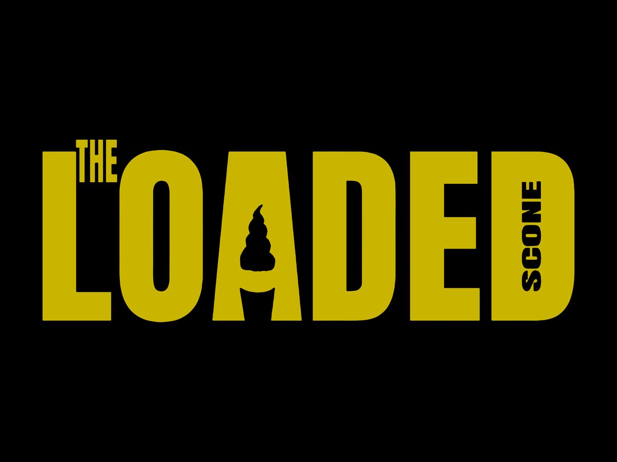
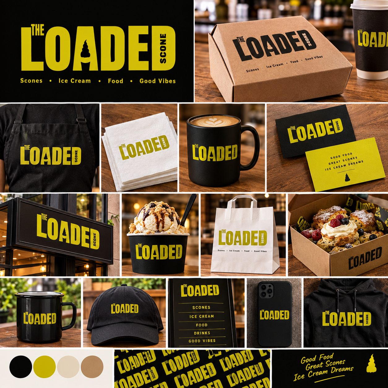
Loaded scones, cream teas and ice cream. The ice cream sits in the gap of the A, and SCONE is tucked sideways into the D, so the whole name reads as one bold block. It’s strong enough for a shop sign and still clear on a napkin.
Logo design
A logo has to work everywhere you do: on the sign above the door, on a van, on a cap, and as a tiny circle on Instagram. I design ones that hold up in all of those places, for cafés, bands, trades and anyone else who needs one.
Each one starts with the same brief you can fill in below. The mock-ups show the logo where it’s actually going to live. Tap any picture to see it bigger.
Loaded scones, cream teas and ice cream. The ice cream sits in the gap of the A, and SCONE is tucked sideways into the D, so the whole name reads as one bold block. It’s strong enough for a shop sign and still clear on a napkin.
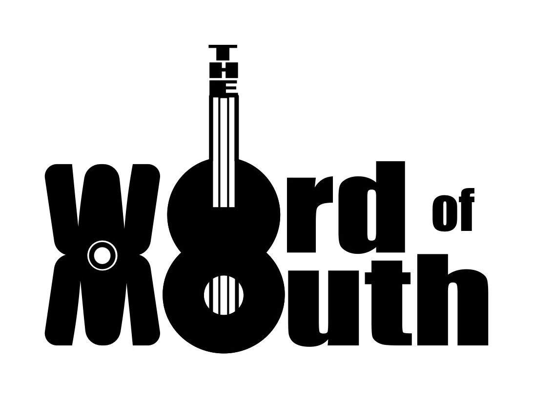
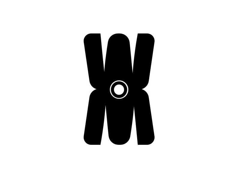
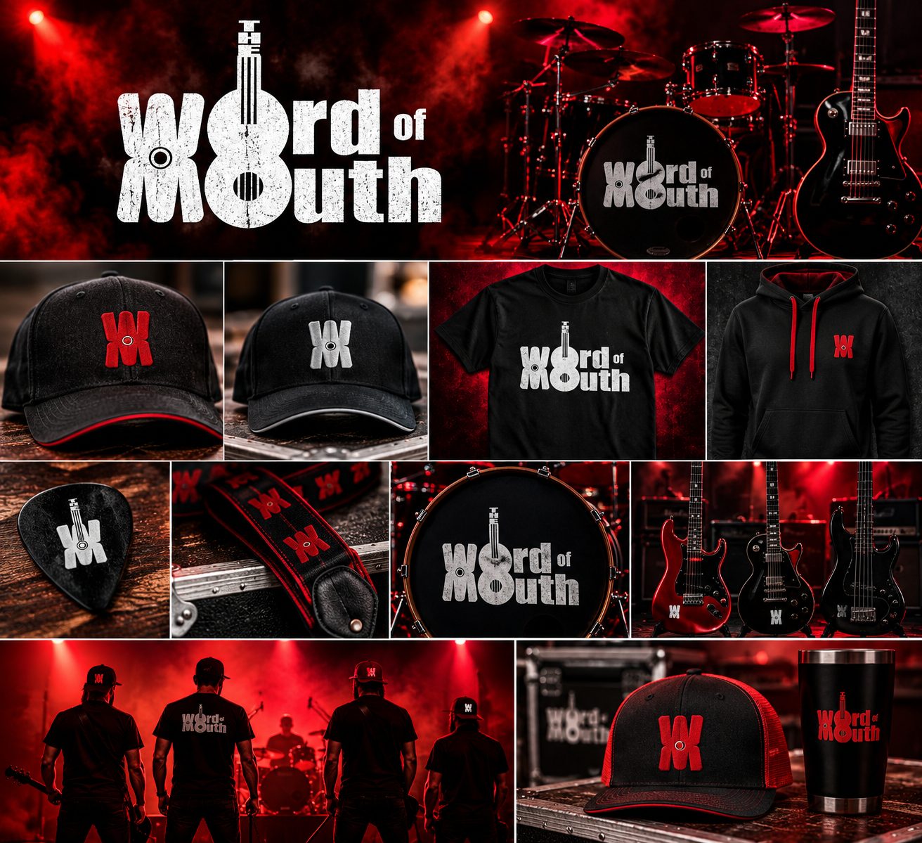
The guitar body becomes the O of “Word” and the O of “Mouth”, with THE running up the neck. Stack the W on its mirror image and you get a monogram that’s small enough for a plectrum, a guitar strap or the front of a cap.
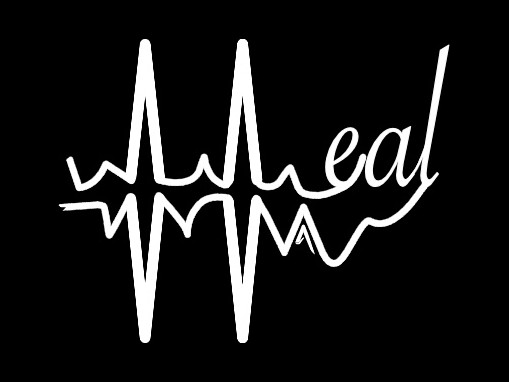
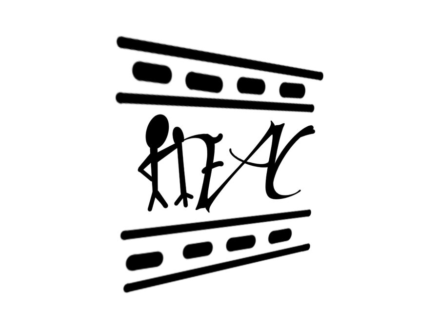
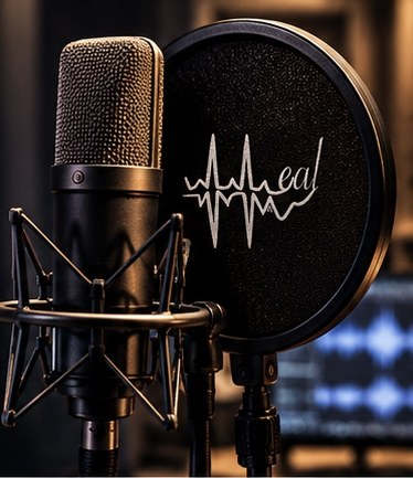
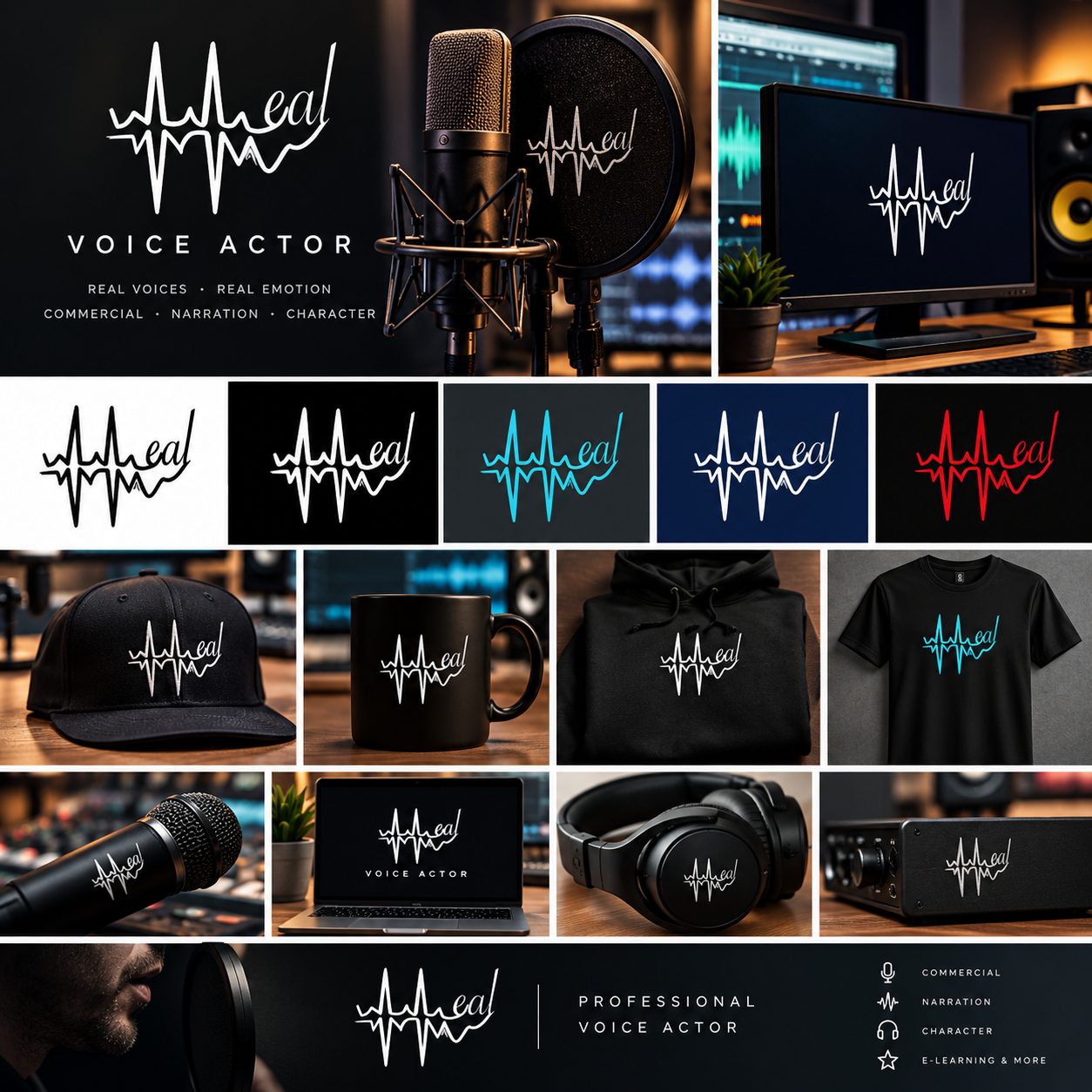
A voice actor who wanted two logos: one for social media, and one for his equipment, clothing and merch. Both spell out HEAL, and in both the H is where the meaning is.
On the kit and the merch, the H is a sound wave. Its two tallest peaks are the uprights, and the wave runs on into a handwritten “eal”. It’s one colour and one line, so it can be embroidered on a cap or etched onto a pop filter and still read clearly.
On social media, the H is a stick man holding a microphone up to his mouth: the voice behind the voice work. Framing it in a strip of film keeps it loose and personal, a face for the account rather than a label for the kit.
No design jargon, and nothing to pay just to ask.
What the business does, who it’s for, the feel you’re after and where the logo will be used. If you’re not sure about something, say so.
Plus some first thoughts on where I’d take it, so you know what you’re getting before you agree to anything.
You see real designs, tell me what’s working and what isn’t, and we change it until it feels like yours.
Ready to use on signs, print, your website and social media.
It depends on what the logo needs to do. A simple wordmark is a different job from a full set with a monogram and a pattern. Fill in the brief and I’ll give you a price before any work starts. Asking costs nothing.
Not at all. Most people don’t know until they see something. The brief’s questions are there to help: what you do, who your customers are, and the feel you’re after. Working out the rest is my job.
Yes. Choose “A refresh of the one I’ve got” in the brief and tell me what’s not working about it now. Often it just needs redrawing so it prints cleanly.
Yes. That’s most of what I do. A logo and a website designed together look like they belong together. Say so in the brief, or see the website prices.
The brief takes about five minutes. Answer what you can and leave the rest to me.